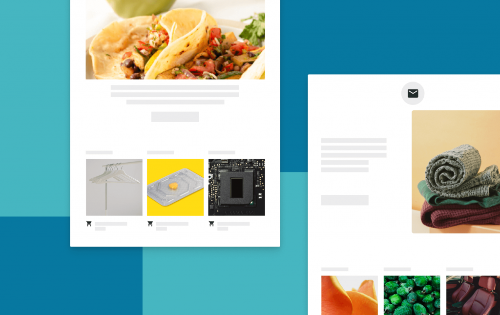
Any Digital Marketer knows that Email Design is crucial to the success of a marketing campaign. The ability to steer potential users to your platform depends heavily on the content of your message, but also on the designs you select.
Reading Time: 2minutesExecuting an email marketing campaign can be a powerful tool for your business–if done correctly.
Best Practices for Email Design
Any Digital Marketer knows that Email Design is crucial to the success of a marketing campaign. The ability to steer potential users to your platform depends heavily on the content of your message, but also on the designs you select.
In this blog, we’ll share some of the best practices for Email Design 101 that we collected from experienced email developers and digital designers.
1. Use the same images in desktop and mobile designs
It can be easy to fall into the trap of using different imagery for different screen sizes, but it’s important to account for your edge cases. What if someone opens their email at one viewport and then expands their screen size, watching the image glitch and change in front of them? The imagery you use should have the same appeal to both desktop and mobile audiences.
2. Don’t use rounded corners for images
Rounded corners may look nice on Desktop, but they will look funky when stretched to the edge of a user’s mobile screen. Focus on making the email design look cohesive so that sharp edges aren’t out of place.
3. Avoid background image and gradients
Some large email providers, including Outlook, will not render background imagery, and some will make gradients appear incorrectly. It’s best to keep images separate and inline.
4. Separate copy and CTAs from imagery
Again, since many users have email providers that don’t render imagery, your key message could be lost if it’s stacked on top of an image. It’s not worth losing a call to action (CTA) to preserve aesthetic appeal – be creative with spacing and structure instead of overlapping imagery and text.
5. Save the trouble of custom fields on images
You can avoid creating a lot of extra work for yourself by not displaying custom fields on top of images. It can be appealing to place a custom field on an image to generate a dynamic graphic, but this will practically ensure that a large portion of your audience misses the message.
At Knowde, we’re fortunate to have some of the best email developers and designers in the business. Smart design, in combination with good copywriting, is essential for communicating the value of our platform, and we hope these tips help you do the same!