As Knowde’s Design Team has grown, so too has the complexity around managing design research, concepts, and final deliverables. It’s important to know that Knowde has a workflow that is still evolving — but is serving us well.
Figma: Project structure, versioning, and components
As Knowde’s Design Team has grown, so too has the complexity around managing design research, concepts, and final deliverables. It’s important to know that Knowde has a workflow that is still evolving — but is serving us well.
Map the Design Org in Figma
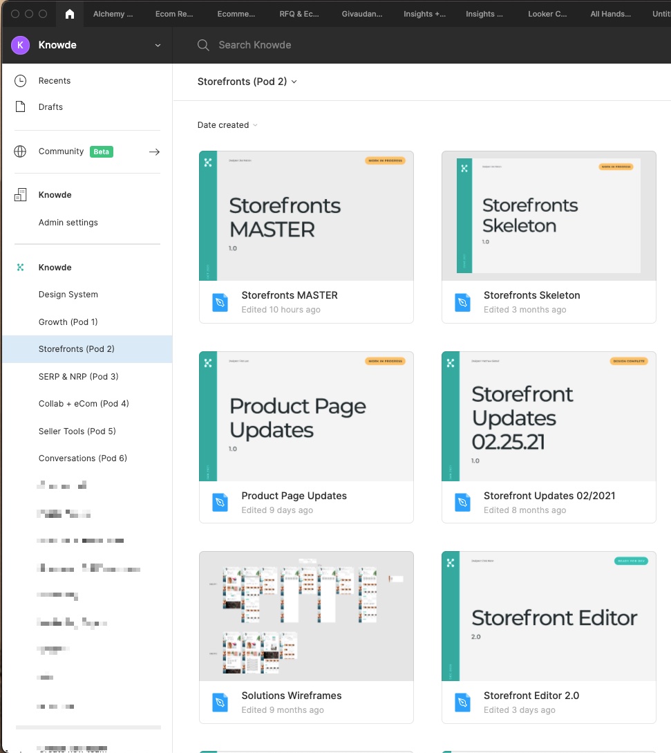
As a team, we’ve sharpened our focus and aligned the engineering and product organizations around distinct Pods with areas of responsibility. In Figma, this shows up as Projects in the sidebar of the Figma homescreen, with each Project mapped to the Pod and/or design pillar.
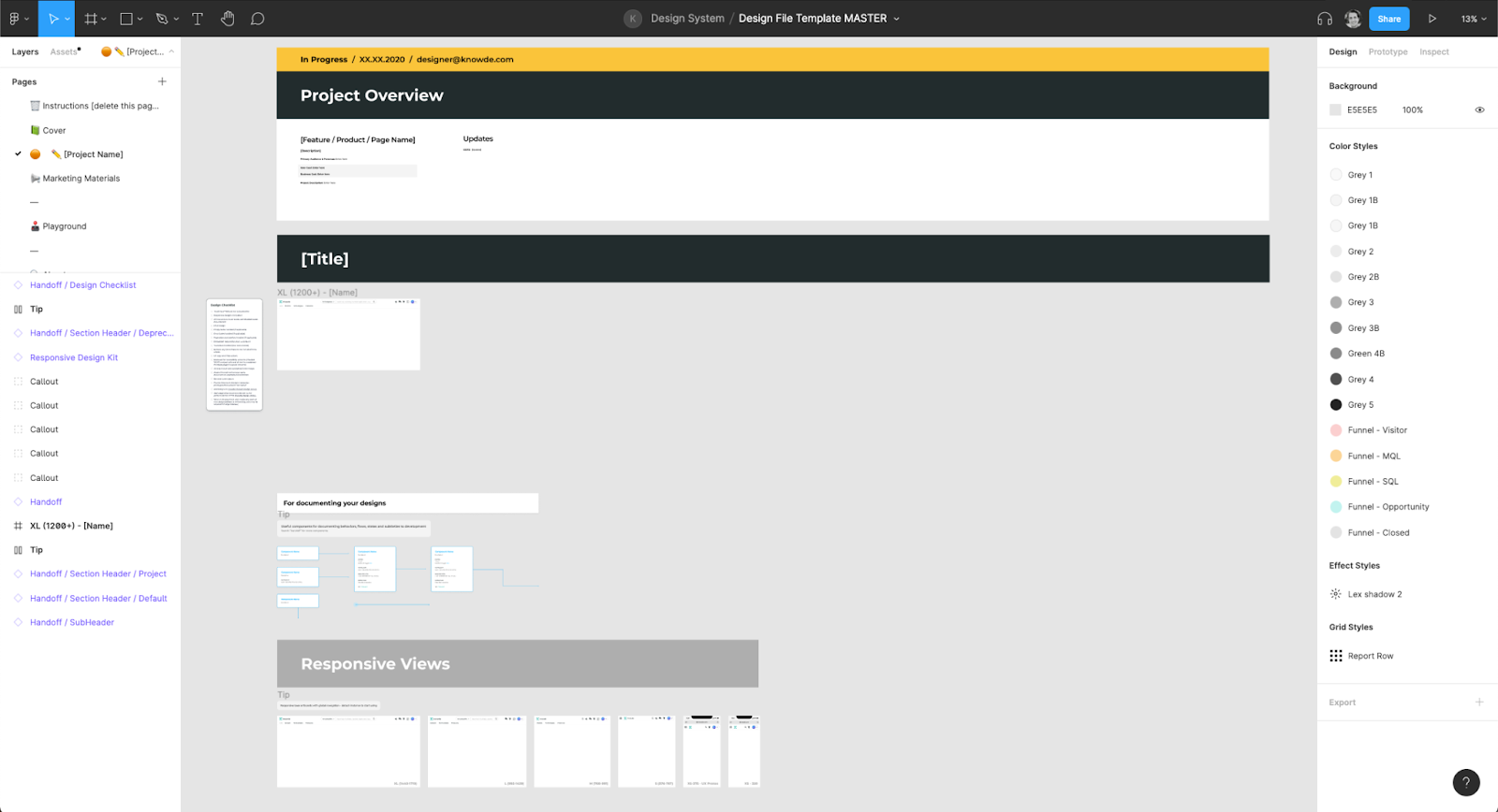
We’ve taken it a step further by naming our files with large scannable cover frames, specifying the designer and document status.
The visual thumbnails Figma produces can work well, but our files tend to be large repositories of designs, annotations and screenshots where the usefulness diminishes quickly.
Project structure and establishing sensible defaults
Defaults are automatic selections put in place on the user’s behalf. We use them to keep the user’s attention focused on value, and remove potential barriers.
What makes a default “sensible”? Thinking power is a finite resource – the more we treat it as something that runs out, the more we as designers become conscious of what really deserves attention. We’ve done this for ourselves by creating a default baseline template in Figma that we use to start all new design work. It is not prescriptive in terms of what must be done, but it lays out the tools with all of the linked and component materials needed to build the next project.
As a sensible default, we tell the designer what to do with this file as soon as it’s opened. The subsequent pages are the Cover thumbnail and various placeholder tools we have as part of research and design.
On subsequent pages in the document, we lay out the tools we use as a baseline towards our objective of delivering outcome-driven designs and all the nuances of building a platform with multiple roles, permissions, and use case scenarios. Here’s what most of our design pages start as:
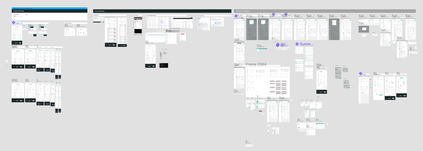
And after all the research, ideation, and iteration churn can end up as any form of something like this:
This isn’t the only way we deliver designs, and the particular example above has designer and prototype miscellany that has been moved off to the right, while the core designs and pieces that our engineering partners use are usually to the left and fully documented as part of handoff.
Managing Figma managing itself
Let’s have the conversation we don’t want to have. Figma is great but doing big things with it can lead to big problems, if you’re not set up properly. All of the designers at Knowde have fully loaded 16” MacBook Pros with heaps of RAM (that’s a comp. sci joke) yet we have run into problems. Sidenote: if you like fast laptops, come work with us. Our fully-remote design team is actively hiring, gives developers 16” M1 MacBook Pros with 64gb of RAM and a home office stipend, and we also happen to have a world-class design team building the biggest B2B marketplace in the world.
Working with multiple design sizes, annotations, screenshots, components, states, and more in a Figma doc can lead to the dreaded memory warnings and error banners at the top of a document.
We have found the best technique to prevent this is to break-up large files into multiple pages and adhere to a series of best practices which Figma has detailed here. The short version is:
Consider 60% usage warnings = 100%. We’ve seen sudden performance cliffs in memory usage that make a file almost impossible to open or get into when a file stays at only 60% and will suddenly shoot to 100%.
Limit the number of hidden layers you have in components. Use variants as a way to maintain different component states
Downsize screenshots stored in the Figma library using the Downsize plugin to reduce memory usage
Keep an eye on the number of objects on a page.
If your file catastrophically crashes, you may be able to salvage designs by going to the Recents tab (or any file browser) and OPTION + SHIFT + Right clicking on a file to see the “Restore from version” option
Answering the age-old question: “Where is that file?”
By organizing our designs in files, and using Projects as proxies for our Pods, our file structure is fairly straightforward. Admittedly, we have started to have files lie outside the bounds of our current Pods, which has made us aware of the need for additional resources devoted to the platform as a system unto itself, rather than working on the innovative ideas we’re trying to move forward. Assuming that files have been published to the appropriate Pod and aren’t drafts in the user’s Figma profile and that permissions are enabled to allow anyone in the organization to open the file, we use the Project/Pod structure augmented by the Figma search functionality to easily understand where to find the main solutions.
We have also started versioning and timestamping editions of files as we move from Master Idea and rendition to successive iterations.
Figma does have versioning available out-of-the-proverbial-box, but designs retrieved through the Versions tab are restored as Bezier paths. So they’re not the various object types we have available in the real-time design environment, e.g. type objects, components, etc. and they’re only useful for retrieving designs in the event of major loss and retracing the objects anew.
Components
It’s natural to use concepts of chemistry with design in our own designs for Knowde’s ingredient, polymer and chemistry marketplace. So we too, use atomic design principles as part of our component design in each Figma file
We have largely adopted two or three patterns as part of this construction in Figma:
Try and start from the many beautiful building blocks we have in our alchemy design system.
Use custom components only when they elevate the experience for the user beyond what is available as a baseline in our design system.
Denote custom components in designs.
A subtask which often happens in conjunction with that last point is the separation of components that we use for prototypes and visual effects from the actual base atoms, molecules, etc. This is an important task as part of handoff and collaboration with engineers. There is a myriad of work done towards “final handoff,” but we use these principles to achieve enormous structural direction with vital details, while also working on being close partners with our engineers. The construction of components, collaboration with engineers, and the partnerships we build ensure that we’re not just “lobbing designs over a wall.” This is the hallmark of a great design team and ensures consistency and adherence to the standards we expect of each other.
These are certainly not all the ways we work with our current design platform of choice, but some of the primary ones. Let us know if these techniques are helpful for you and your organization, or if you have any suggestions for improving our own Figma Processes.